


on Making Shared’s Pride Liquid Glass App Icons
A different rainbow


At Apple’s World Wide Developer Conference earlier this month, they announced a new software design across its platforms that uses a new material called Liquid Glass. “Liquid glass?” you assk…
“This translucent material reflects and refracts its surroundings, while dynamically transforming to help bring greater focus to content, delivering a new level of vitality across controls, navigation, app icons, widgets, and more.”
— Apple introduces a delightful and elegant new software design
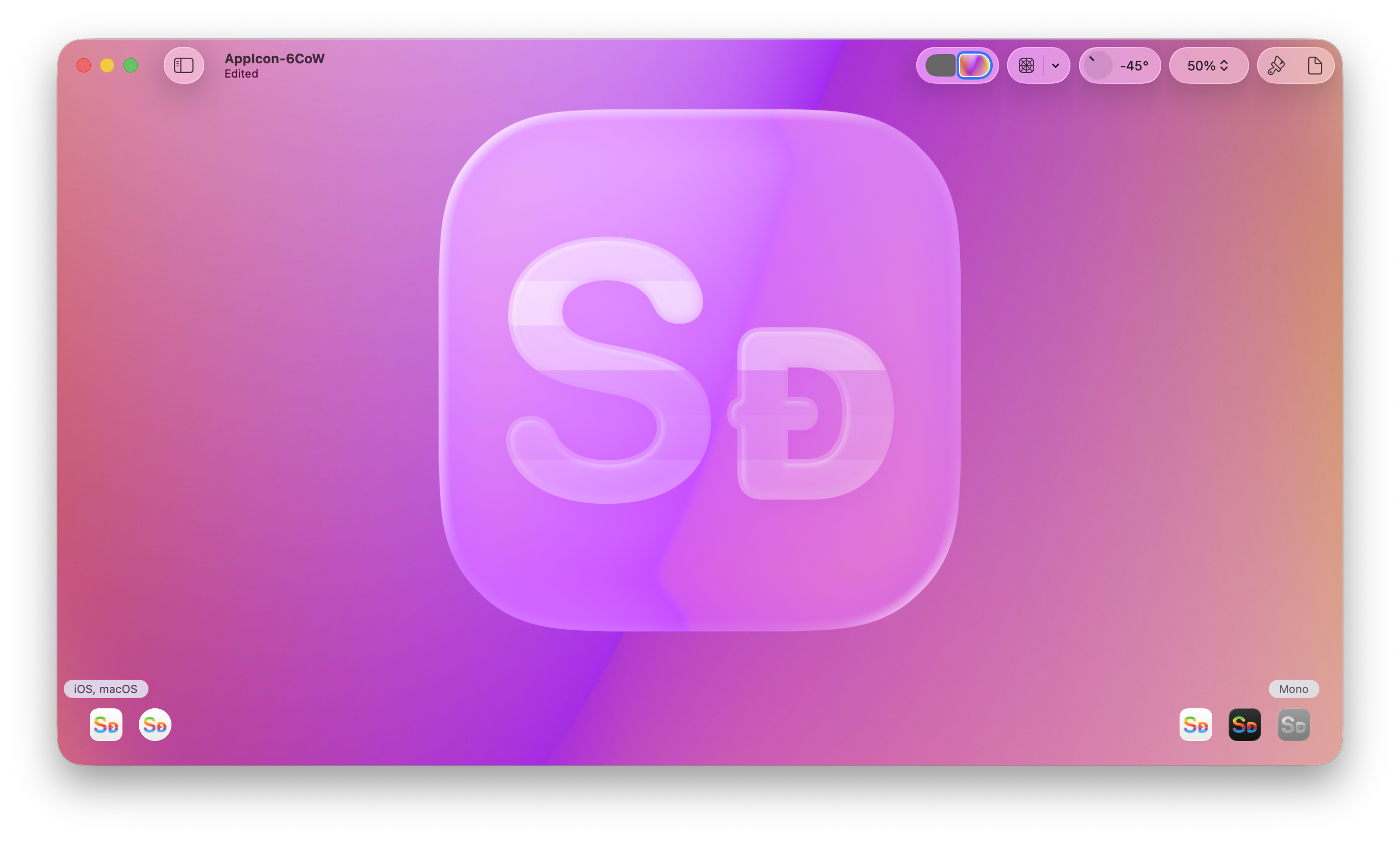
For the past week or two, I’ve been making Liquid Glass versions of Shared’s 66 app icons. I used to use Sketch to make the app icons, but I moved to Figma when making the Tire pack. To aid us developers and designers in adopting this new material in our app icons, Apple released a new tool called Icon Composer.
It lets you import assets for your app icons and then adjust the background, color, and a bunch of other Liquid Glass properties to your liking. What’s also great is that you don’t have to export different versions of the icons for all your platforms. Xcode just takes that file in and uses it for your app across the platforms.
Liquid Glassifying The Original Rainbow
When I made the existing rainbow app icons in Shared, I modeled them after Apple’s rainbow logo from 1977.

As this is just for the rainbow icons, there’s nothing special about the backgrounds. I did do a few special things for the logos though...

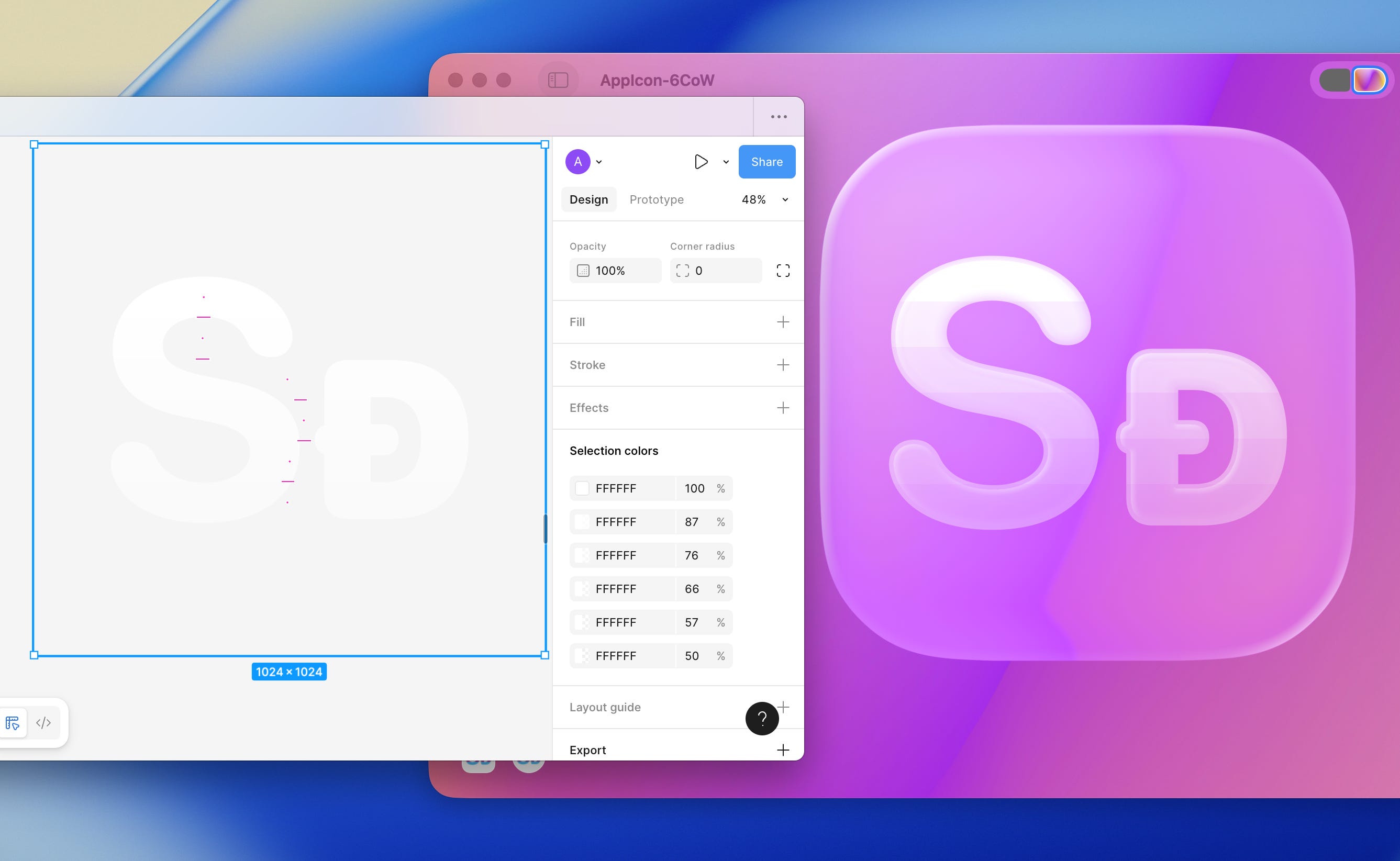
I used to be able to make a striped rectangle and mask it with the logo. That worked great when exporting as PNGs and SVGs from Figma and importing them into Xcode’s Asset Catalog, but Icon Composer didn’t like that:

So—after a few rounds of trial and error—my solution was to use the intersect tool to make 6 different vectors (one for each slice of the logo) and combine them to recreate the icon:

But now, the next hurdle was what that would look like when the Home Screen’s icons were clear. Thankfully, this was not uncharted territory. I knew that if you didn’t provide an alternate tinted icon, iOS would create a grayscale version of the standard app icon and then apply the tint to that.
I wasn’t happy with that, so I created a separate icons for iOS 18’s tinted appearances:

Icon Composer seems to do a similar thing when making a colored icon clear…
So I took that reconstructed icon, changed all the colors to white, and changed their opacities until I was happy:
I don’t actually know why I hadn’t made pride app icons until now. I had been out for 7 years by the time I added custom app icons in last year’s 2.0 update, so I don’t think it was a case of not feeling comfortable with it… Oh well, better late than never.
Queerifying The Rainbow
Now I that I knew how to make a Liquid Glass multicolored Classic Shared app icon, I just had to pick the colors. So, I googled a pride flag, inspected the colors, and…

Which was… a look. But I liked the colors of the original rainbow more. So…

I was happy.
The process of making both rainbow versions of the Cornered and Tire app icons was a lot simpler; I just had to select the letters and change the colors.
But when working on the unicolored Cornered icons, I noticed they weren’t as legible with the Liquid Glass effect when scaled down to the iPhone Home Screen.
So I made the logo bolder, went back to the Classic icons and made that logo bolder too, and finally moved on to the Tire icons…

The end result? 72 liquid glass app icons.

Shared 3.0…

I never got to writing about this update—and I don’t think I will—but if you haven’t checked it out yet, you most definitely should!
I started working on the redesign in November 2023, but I put it on hold until December last year. I wanted to release it on Labor day, and App Review’s timing was just right; I hit the Release buttons just as the first flight on my way to New York took off—and thankfully… nothing went wrong.
I hope you like it—and stay tuned for the iOS, iPadOS, and macOS 26 updates later this year. If I don’t release any updates before then, those will be Shared’s 52nd iOS release and 34th macOS release.